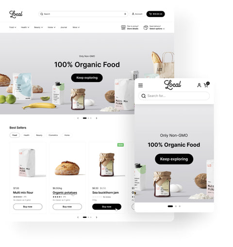
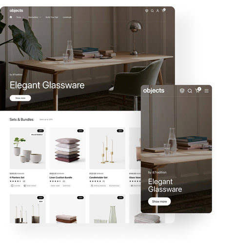
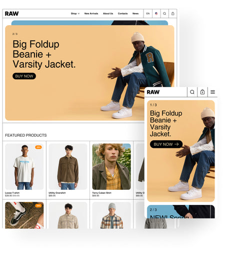
Vertical scrolling sliders present content in a vertical carousel format, as opposed to the more common horizontal slider. In practice, this often means as you scroll down a page, you encounter a section where images or product cards slide up and down like a reel, or a split-screen design where one half scrolls through slides vertically. This format can be a powerful storytelling tool: it takes advantage of the natural scrolling behavior of users (especially on mobile) to reveal products or imagery in sequence. Vertical sliders are visually unique and can create an editorial, magazine-like feel on an ecommerce site, making them well-suited for brands that want to showcase products with a narrative or in a specific order. By leveraging vertical space, these sliders ensure shoppers don’t miss content – each scroll brings the next item into view in an engaging way.
Why Vertical Sliders Enhance Browsing
Natural Scrolling Experience: Users are already accustomed to scrolling down pages. A vertical slider aligns with this behavior, often feeling more intuitive than horizontal carousels that require clicking arrows or swiping. As noted in our theme design, optimizing use of vertical space is very effective for both mobile and desktop, since visitors scroll vertically far more often than horizontally. In short, vertical sliders work with the grain of how people browse, rather than against it.
Immersive Storytelling: Vertical sliders can be used to craft a narrative flow – perfect for industries like fashion or home decor where you might want to reveal a “story” item by item. For example, a fashion retailer could design a vertical lookbook where each scroll unveils the next outfit or model shot, creating a sense of progression. Because the content stacks, it can feel like flipping through a magazine or walking through an exhibit. This is great for editorial-style presentations that build excitement or context around products.
Maximizing Content in Less Space: They allow multiple pieces of content (images, text blocks, product sets) to occupy a single section of a page without overwhelming the layout. A vertical slider might show, say, three products in a collection – one at a time in the same space – rather than all three at once in a long column. This conserves page real estate while still giving each product its moment to shine. It’s an elegant way to include rich content without making the page infinitely long.
Higher Engagement: Movement on scroll catches the eye. As shoppers scroll and see a portion of an image or text slide into place, it grabs their attention and encourages them to continue interacting. Vertical sliders often come with subtle animations (like parallax effects or fade-ins) that add to a premium feel. This interactivity can keep users on the page longer as they scroll back and forth to view slides, boosting engagement with the featured products or images.
Industries that Benefit from Vertical Scrolling
Certain types of online stores particularly leverage vertical scrolling sliders:
- Fashion & Lookbooks: Clothing brands with seasonal lookbooks or campaigns can use vertical sliders to present each look. It creates an editorial flow – much like pages of a fashion magazine – allowing customers to consume the style story piece by piece. High-end fashion sites often use this to emphasize visual impact and lifestyle imagery.
- Home Decor & Furniture: Home interiors can be showcased room by room or angle by angle in a vertical slider. As users scroll, they might see the living room, then the dining setup, then a bedroom, each sliding into view. This feels more organic and narrative than clicking through a gallery. It’s like a guided tour of a styled home.
- Cosmetics & Before/After Showcases: A beauty brand might display a model’s look evolving – primer, then foundation, then finished makeup – each stage on a new slide down the page. This vertical sequence can educate and sell at the same time.
- Editorial or Storytelling Brands: Any brand that emphasizes content (travel gear with travel stories, food products with recipes, etc.) can interweave images and text in a vertical slider to tell a cohesive story. Each scroll might alternate between a striking image and a descriptive text block, keeping the reader engaged.
In all these cases, the vertical slider format lends a curated, storytelling vibe that standard product grids or horizontal carousels might not achieve as effectively.
Best Practices for Vertical Scrolling Sliders
- Optimize Images for Vertical Display: Because vertical sliders often use tall or split frames, use images that fit the intended aspect ratio. In some of our themes, you can set specific aspect ratios for desktop and mobile to ensure the slider looks balanced. Avoid extremely wide images that might get cut off; instead, favor images that have some height or can be cropped appropriately. Also consider preparing separate images for mobile vs. desktop if your theme allows – this can maintain quality and focus on smaller screens without slowing down load times with unnecessarily large images.
- Keep Text Readable and Minimal: If each slide contains text (like captions or product names), make sure the text is large enough to read and has sufficient contrast against the background. Users will be scrolling, so you want the message on each slide to register quickly. It’s often best to use vertical sliders for visuals and short taglines, rather than long paragraphs (which might be better placed as static text outside the slider).
- Indicate the Sliding Action: While vertical sliders take advantage of natural scrolling, it can help to have a visual cue that it’s a slider. This could be subtle arrows or indicator dots alongside the content (on the side or bottom of the slider) to show there are multiple slides. Another approach is numbering (e.g., “1/3, 2/3, 3/3”) or small sticky headings that change as slides change (like showing the title of each section). These cues assure the user that as they scroll, they are navigating through controlled slides and not just the general page.
- Smooth Scrolling and Snap Behavior: Implement smooth transitions between slides. Many vertical sliders use a snap scrolling effect – when the user scrolls near the next slide, it gently “snaps” fully into place. This ensures each piece of content is fully in view without half-cut images. Configure your slider so that it doesn’t feel jerky. Test with a mouse wheel and touch gestures: the transition should be fluid, giving a polished feel to your site’s UX.
- Limit the Number of Slides: Just as with any carousel, too many slides can dilute the impact. Curate the content to maybe a handful of strong slides (5 or fewer, as a guideline). If you have more to show, consider breaking them into distinct sections or use a different format beyond the main slider. Users can lose interest or get frustrated if they have to scroll through a large number of slides. Keep it concise and impactful.
Vertical Sliders in Krown Themes
Krown Themes is known for unique layouts, and we’ve embraced vertical scrolling sliders in our theme designs.
For example, our Borders theme features a signature vertical slider section that truly stands out. It allows merchants to showcase products or lookbook images in a vertically oriented format, which is especially engaging on mobile where vertical scrolling is second nature. In Borders, this slider can even autoplay videos within the slides or be used as a dynamic banner, providing a creative canvas for brands.
Similarly, our Highlight theme includes a Parallax Vertical Slider that creatively displays products, collections, and promotions in a stacked, storytelling manner. All Krown vertical sliders are built to be intuitive: they respond to scroll, include indicators, and are optimized for performance. We give merchants control over aspects like aspect ratio and slide content, so they can tailor the experience.
By integrating vertical scrolling sliders into our themes, Krown Themes helps stores (especially those with a strong visual story) differentiate their site and keep customers scrolling eagerly through their content. It’s a modern, sophisticated feature that comes standard in our themes, enabling even small brands to deliver an immersive, premium browsing experience.


